


Nutrimay: brand identity, colour and typography system for a premium dry fruits and healthy snacking brand
Healthy snacking sells restraint. This one had to sell the lift.
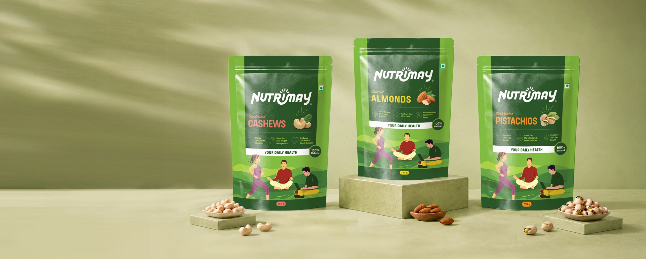
Nutrimay is a premium dry fruits and healthy snacking brand. BBT built the identity and the system that governs it, from the wordmark and palette through typography to the guide that tells everyone downstream how the brand is allowed to behave.
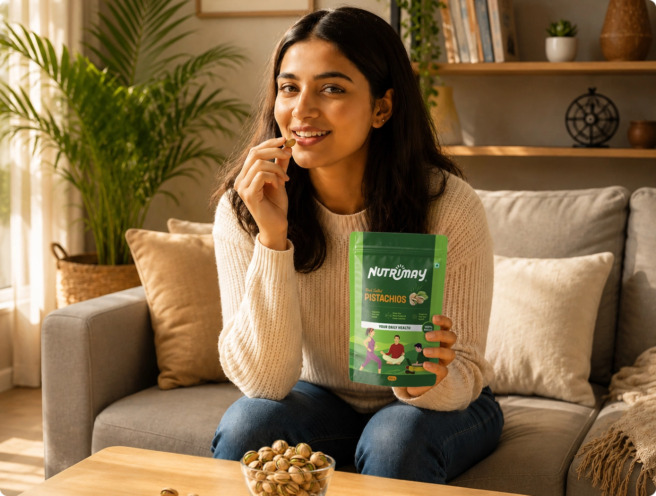
Most of this category sells subtraction. Fewer calories, less sugar, no guilt. The opening was to sell the opposite feeling, the small lift of having made a good choice rather than the relief of having avoided a bad one.
- Logo design
- Wordmark construction
- Colour system
- Typography
- Brand guide
- Usage rules
- Legal mark specification
- Artwork handover
.webp)
.webp)
.webp)
What the system taught us.
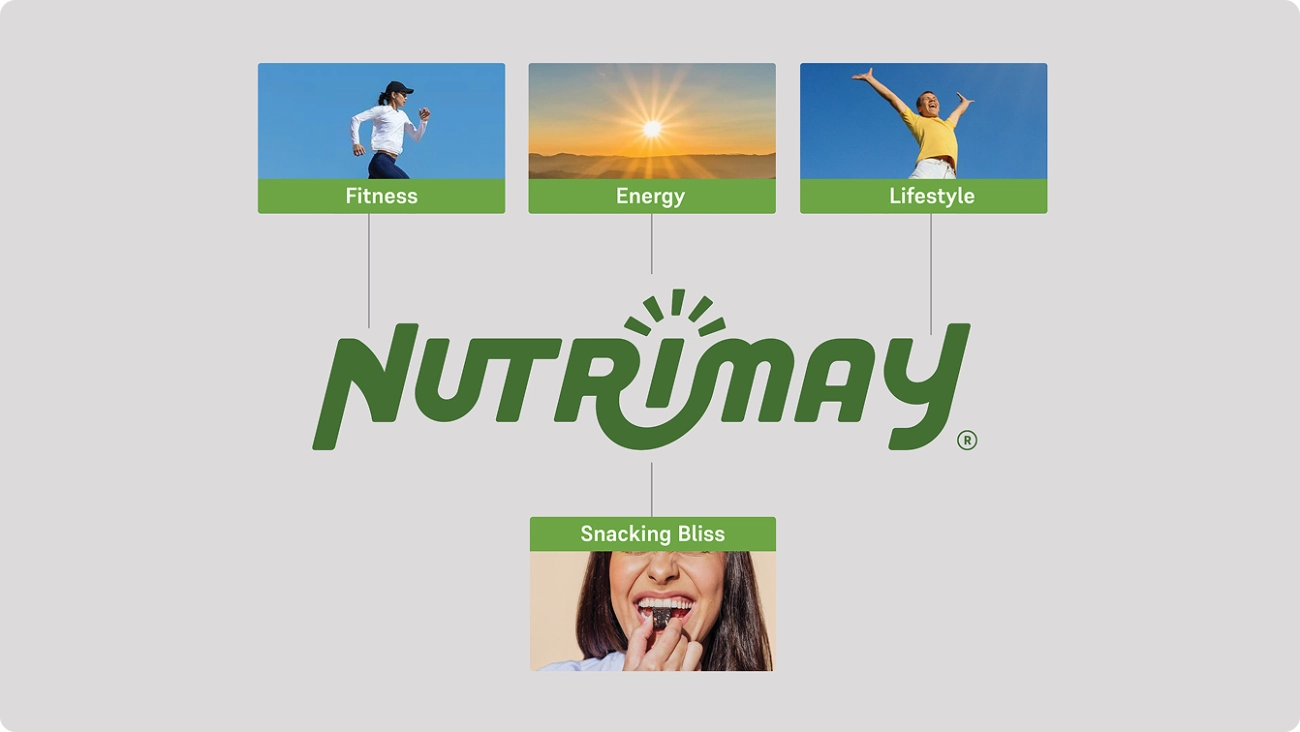
Four ideas, eight letters
The N leans forward and doubles as a thunderbolt. The Y is the happiness that follows a better habit. The rays on the I stand for awareness. The italic curve is the food itself. None of it needs explaining to work.
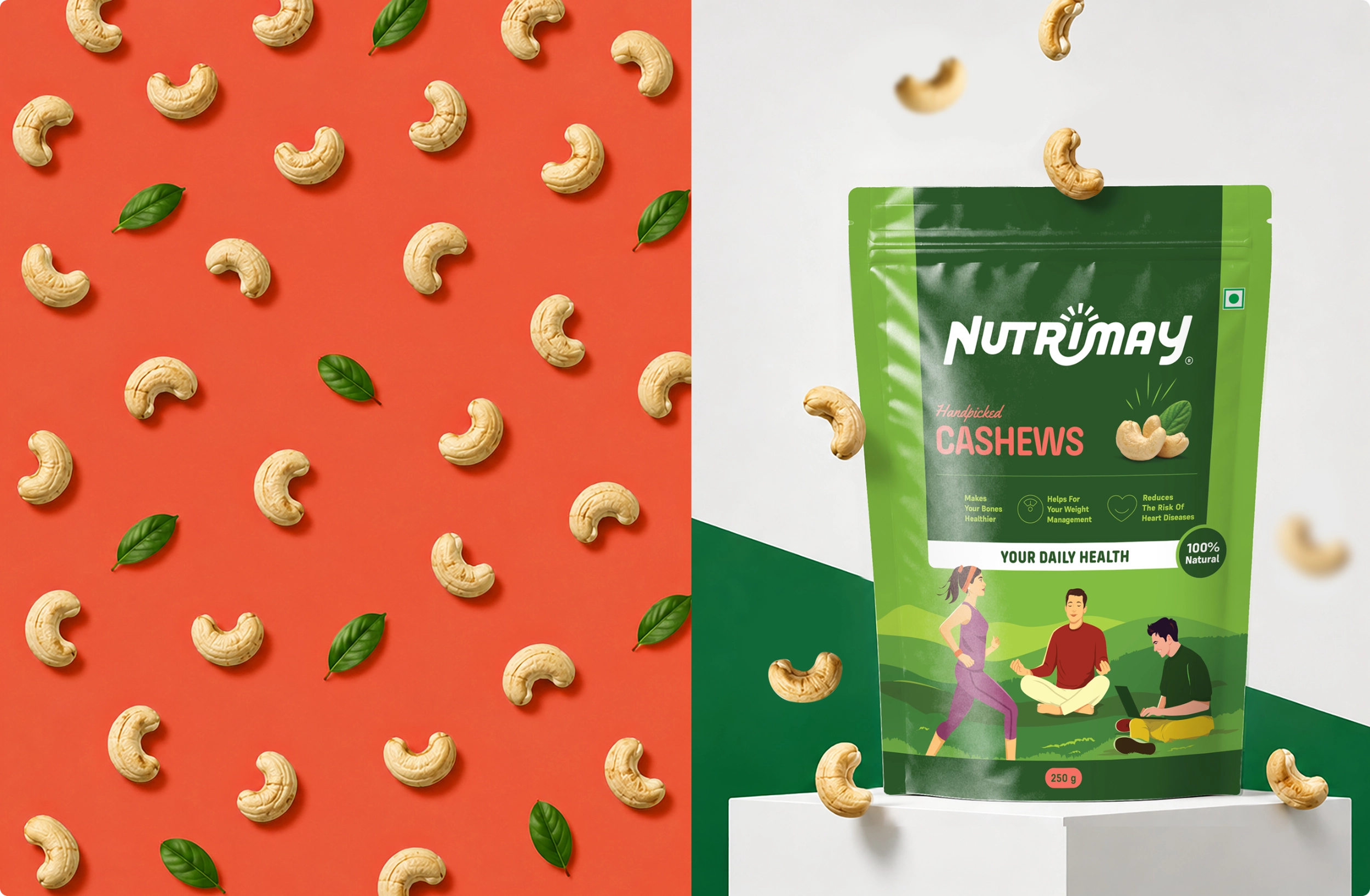
One green is a category. Six greens are a system
Deep green anchors the brand. Five graded greens rise to a lemon accent so a pack, an infographic and a listing can all build hierarchy without leaving the palette. The differentiator is not the colour. It is how many of them you can put in order.
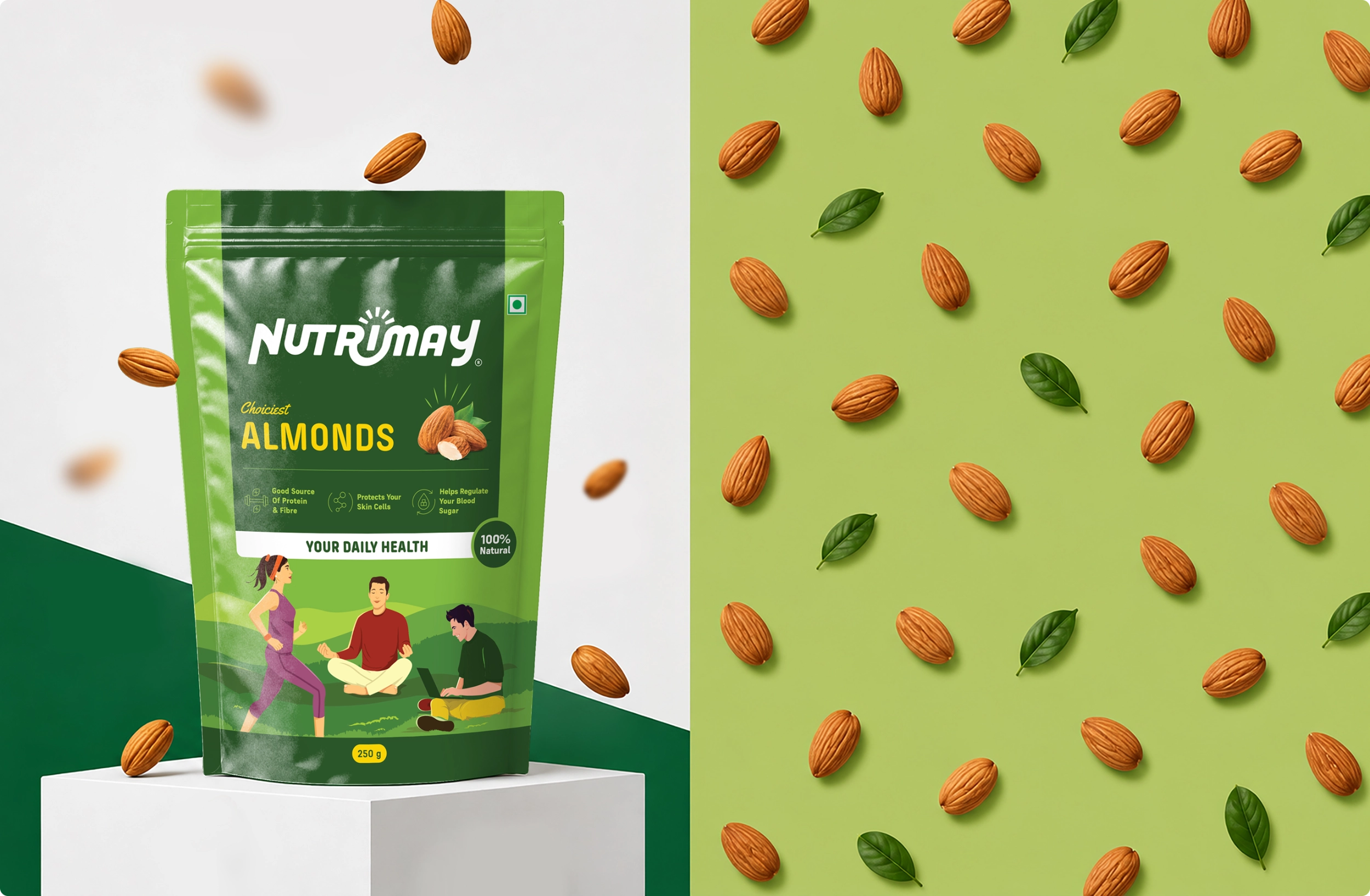
Type that does two jobs
Alan Sans carries the warmth and the headlines. Supreme carries the ingredient panels and the listings. One face for the feeling, one for the facts.
The guide stops the drift
Clear space, minimum sizes, misuse and where the registered mark sits. That is not fussiness. It is what stops a brand drifting the first time artwork reaches a printer nobody briefed.
.webp)
.webp)
.webp)
.webp)
.webp)
They did not hand us a logo. They handed us a system the printer could not break.