


01
Identity & design
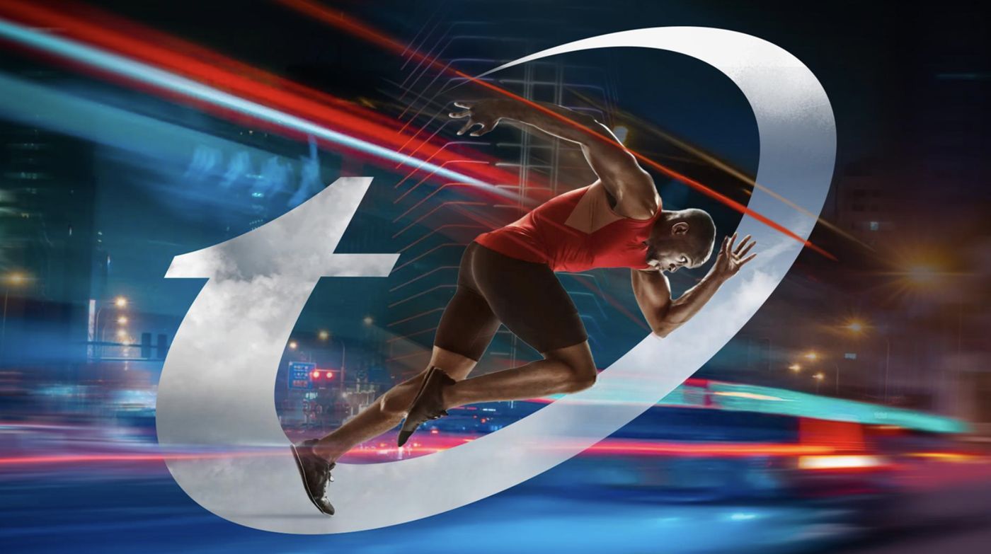
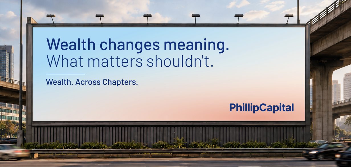
The visible systemLogotype, symbol, colour, typography, imagery and the layout logic that holds them together. It has to work at sixteen pixels and on a forty-foot hoarding.

We resolve what the brand must stand for, then build it into the world.
Start a conversationinfo@bigbrandtheory.inClarity creates » Momentum®
Define ends with one decision. Build is where that decision becomes something a customer can recognise, a team can produce and a machine can reproduce, without anybody having to be told what it meant.

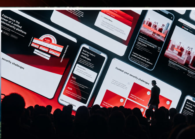
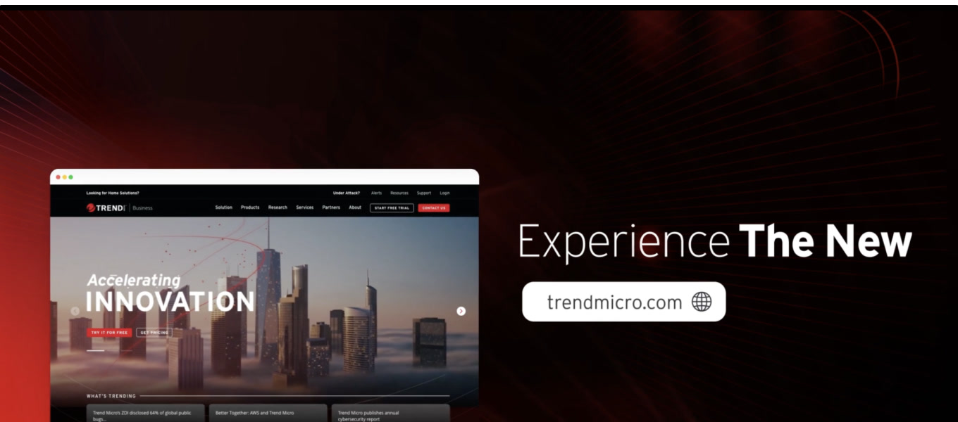
A brand is not a logo. It is the same decision, made visible again and again, by people who were not in the room when it was made. Build is where that becomes possible.
None of these are design problems. They are all problems of a system built without the people who have to use it.
Five bodies of work, run together rather than in sequence, so the words and the design agree with each other. Not every engagement needs all five.
Logotype, symbol, colour, typography, imagery and the layout logic that holds them together. It has to work at sixteen pixels and on a forty-foot hoarding.
Tone of voice, naming, and the words the brand refuses to use, written so a writer, an agency and a language model all land in the same place.
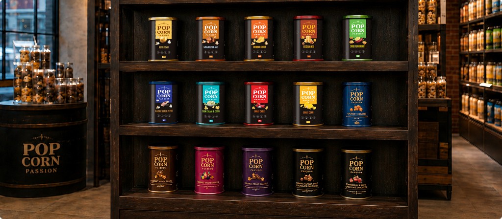
For most consumer businesses this is not a touchpoint, it is the brand. Structure, graphics, range logic and artwork built for the production line.
The platform and the work that takes the position out of the document and into the places people actually encounter it.
Website, product interface and platforms, built from the brand system rather than styled to look like it afterwards.
Each of these had to work across dozens of touchpoints and several countries. That is the test.
Most identity work is judged on how it looks to a buyer. It has to hold for five more audiences than that, at the same time.
Six things leave with you. Every one of them is built to be used by somebody who was not in the room.
Run by the same senior people who resolved the position. Build sits inside a Mission Project or a Strategic Programme.
Identity, colour, type, imagery and the layout logic, resolved as a system rather than a set of files.
Tone of voice, naming and vocabulary, written alongside the design so the two agree.
The priority touchpoints designed for real: packaging, site, campaign, the documents the business actually sends.
Guidelines, asset libraries and a BrandCode file, handed to the teams and partners who will use them.
Scoped per SOW, against the touchpoints you actually need.
Build is delivered inside a Mission Project or a Strategic Programme, and priced with it rather than separately.