




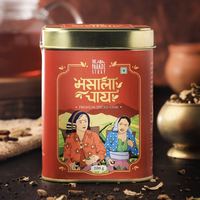
Spirit of the Tribe: brand refresh, illustration ecosystem and packaging design for a traceability led D2C social enterprise
Most food brands put the product on the front. This one put the person who grew it.
Spirit of the Tribe is a direct to consumer food brand built on traceability, run by Ncourage Social Enterprise Foundation, an initiative of Tata Chemicals. Its purpose is livelihood creation and transparent sourcing, drawing on the produce and craft of indigenous Indian communities.
The purpose was never in question. The difficulty is that purpose is invisible on a shelf, and urban buyers with unlimited choice do not slow down for a supply chain, however honest it is. A brand built on where things come from still has to win the two seconds before anyone thinks to ask.
Provenance is a story. A shelf has no time for stories.
Everything SOTT stood for lived in detail. Farms, routes, communities, methods. Detail is the first thing a crowded category strips out. And the competition was never other social enterprises, it was every well funded D2C brand with a design budget and a clean pack. Purpose earns a second look. It does not earn the first one.
- Sourcing research
- Community immersion
- Category audit
- Brand strategy
- Positioning
Put the protagonist on the front.
Most food brands lead with the product and credit the grower in small type on the back, if at all. We inverted it. The Indian woman farmer became the identity itself, her tribal headgear the mark of pride, origin and authenticity. We called it The Protagonist Connect. Traceability stops being a claim the moment it has a face, because a face is the one piece of provenance nobody needs to verify.
- Brand idea
- Brand narrative
- Identity direction
- Messaging
- Tone of voice
A stamp, an alphabet, and a palette borrowed from the ground.
The logo was drawn as a stamp, the oldest shorthand there is for this came from a known place and passed through known hands. Around it, custom illustration of rural terrain, farms and tribal artistry. Typography fusing the Baloo family with local scripts so each product could carry its own place of origin. Colour pulled from the geography itself, earthy but bright enough to survive a screen. Ornamental and premium at once, which is the register almost nobody in this category gets right.
- Logo and identity
- Illustration ecosystem
- Typography system
- Colour system
- Art direction
- Brand guidelines
The new brand identity and packaging were implemented seamlessly. They play the role of true brand custodians.
The pack as the route from farm to home.
Packaging carried the whole journey. Illustration showing terrain and origin, information that traces rather than reassures, and a system consistent enough to hold a growing range while letting each product name its own source. Everything was documented so digital campaigns, social and retail packaging stay recognisably one brand. In a traceability brand the pack is not the wrapper. It is the receipt.
- Packaging design
- Packaging architecture
- Origin storytelling
- E-commerce assets
- Retail communication
- Digital and social
Purpose, made competitive.
Build note · Confirm before publishing. Award name, category, awarding body and year. Retail and e-commerce listings, SKU count, sell through, farmer livelihoods reached, and written permission to name Tata Chemicals
Spirit of the Tribe, in short.
What is Spirit of the Tribe?
Spirit of the Tribe, or SOTT, is a direct to consumer food brand built on traceability and authenticity. It brings farm to consumer products drawn from the produce and craft of indigenous Indian communities, and is built around livelihood creation, farmer empowerment and transparent sourcing.
Who is behind Spirit of the Tribe?
Spirit of the Tribe is an initiative of Ncourage Social Enterprise Foundation, which is part of Tata Chemicals Ltd. BigBrandTheory acted as branding agency and design partner for the brand refresh, covering identity, illustration, typography, colour, packaging design and brand guidelines.
What is The Protagonist Connect?
The Protagonist Connect is the brand idea BBT built the refresh on. It places the Indian woman farmer at the centre of the identity rather than the product, with her tribal headgear becoming the symbol of pride, origin and authenticity. The intent is to make traceability visible rather than stated.
What does the Spirit of the Tribe logo mean?
The logo is crafted as a stamp form, the visual shorthand for provenance and approval. It signals that a product came from a known place and passed through known hands, which is the core promise of a traceability led brand.
What typography and colours does Spirit of the Tribe use?
The typography fuses the Baloo font family with local scripts, so each product can carry its own place of origin with regional authenticity. The colour palette is earthy yet bright, drawn from geographic provenance and built for shelf appeal across D2C retail and e-commerce.
More transformations.
See all 31 →The farmers do not supply this brand. They own it.

A state full of makers, and no single name the world could recognise them by.